Value pricing is a new feature we’ve added to your websites to help increase potential revenue from each customer.
Once you enable value pricing on your websites, your customers will begin seeing three options on every storage space they view: a good option, a better option, and a best option.
You know your customers and what they value best, so you’ll have full control of how these options appear. Here are some best practices to increase the likelihood that customers opt in for your higher-priced and more profitable spaces. .
First Things First, What is Value Pricing and How Does it Help You?
Value pricing is a strategy for pricing a product or service based on the perceived value instead of its historical price. When you use this strategy successfully, you can improve your profit by generating higher prices without impacting your sales volume.
Pricing can be difficult to determine. If your prices are set too low, you risk not having a high enough margin to meet your expenses and earn a profit. But if your prices are too high you can lose customers or might not sell enough of your product. This is where value pricing comes in: it offers an opportunity to gain higher and long-term revenue growth.
This strategy is a great way to ensure your customers are happy with the price they’re paying for the value of a product, service, or, in our case, self storage space. This prevents you from short-changing yourself on prices and gives your customer an experience that meets their expectations.
Value pricing makes it easier to sell your products or services for more because you can showcase the value they hold. Letting customers compare all their available options so they can determine what they value opens up opportunities that might not have existed before in terms of rentals you can make.
What Does Value Pricing Look Like for Your Storage Business?

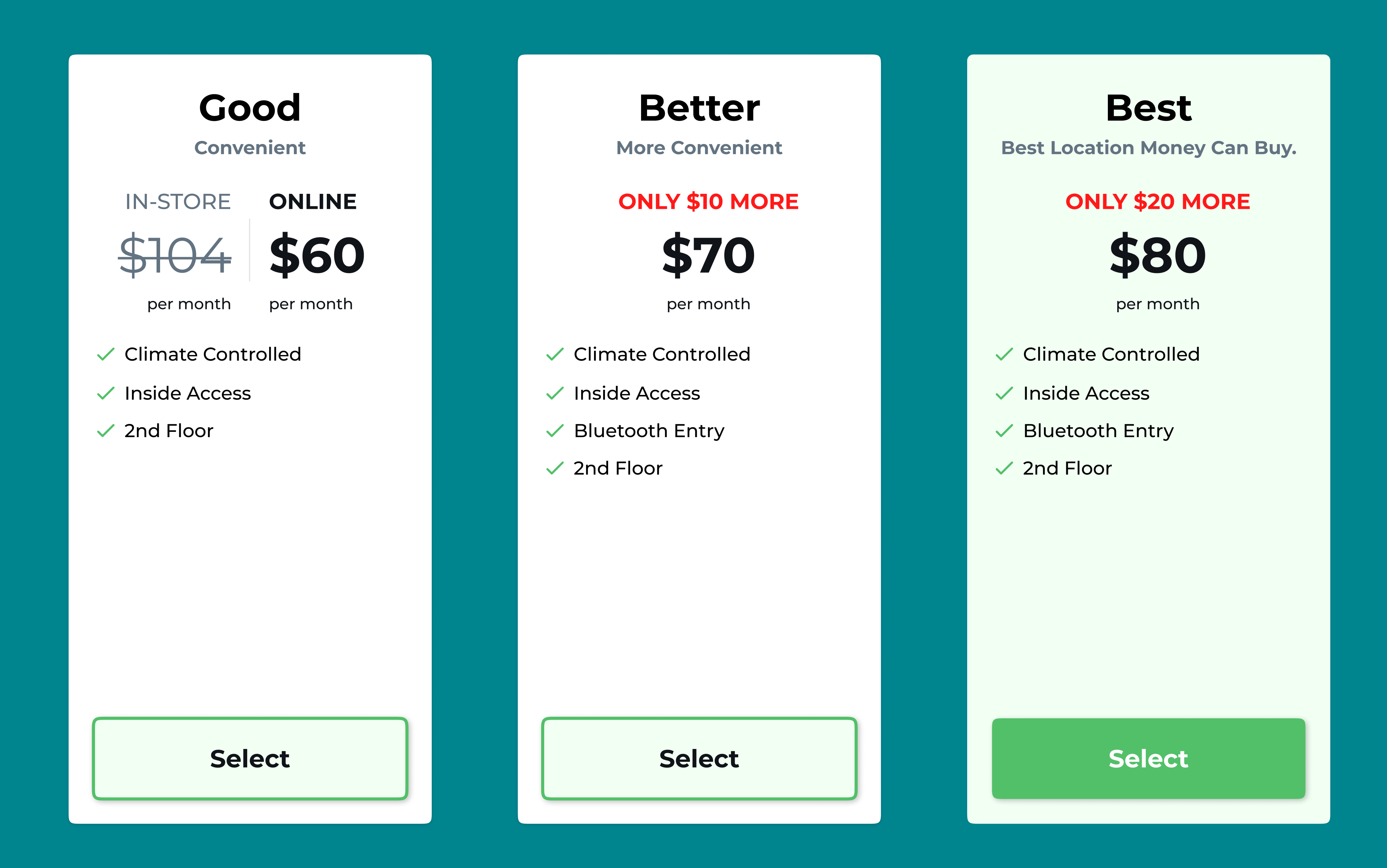
It looks like the image above.
The descriptions might change depending on what you enter, but the layout for the three options your customers will see when they’re renting on your website will be the same. Your website will look the same as it does now, and the customer experience will also remain mostly the same.
The main change comes when a customer selects a space. After they do that, this pop-up will appear presenting a good, better, and best option for the space they selected.
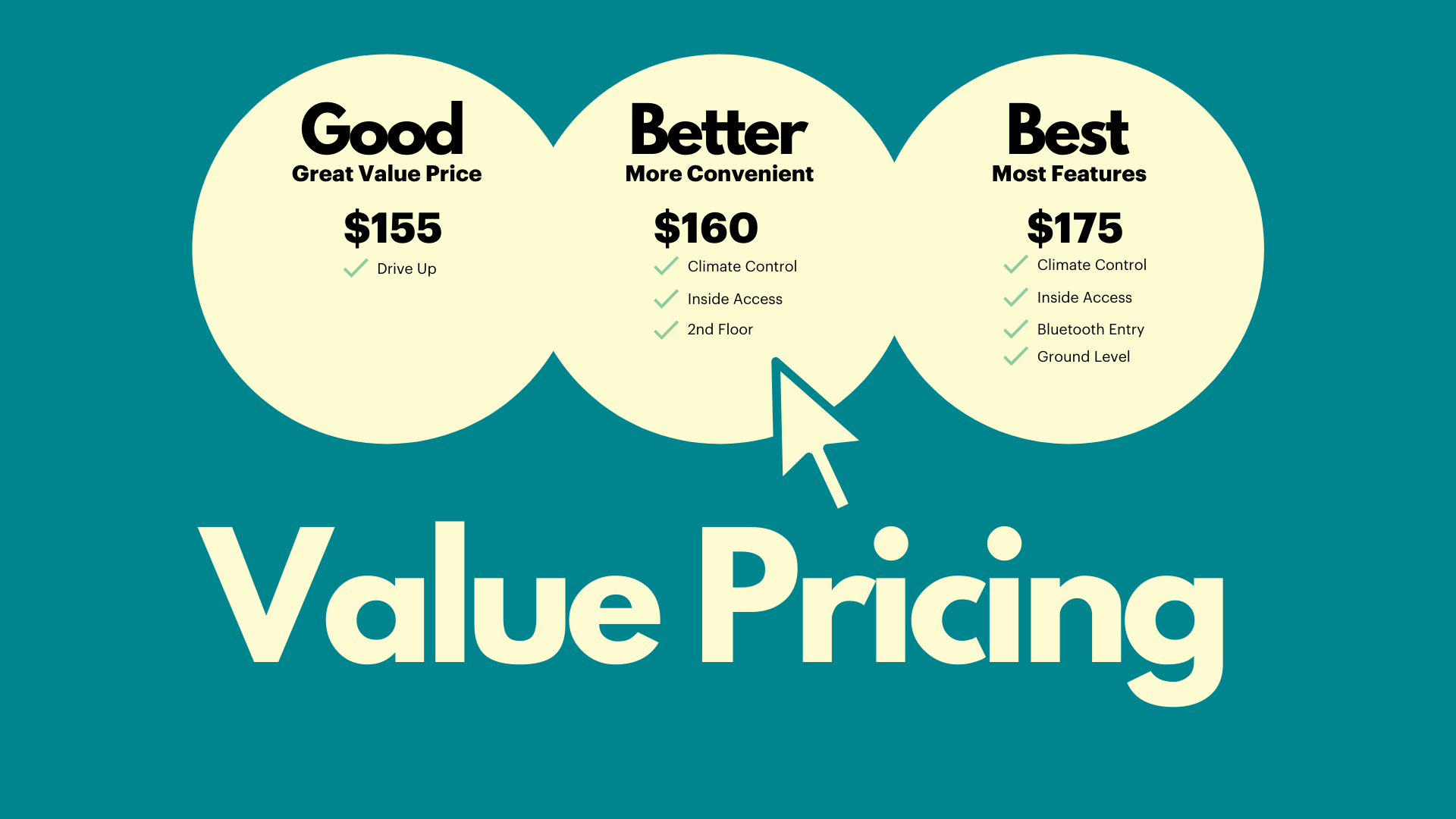
As mentioned, you have full control of the descriptions attached to the storage spaces labeled as good, better, and best. We recommend a natural progression of features, adding more features to give customers a reason to choose the higher-priced options.
The good option should be the most bare-bones option. It should have the fewest features attached to it, and the lowest price to match.
The better option should often be the one that customers perceive as “just right.” It should be slightly more expensive than the good option, but have an additional feature or two that makes it more enticing.
An example of a feature description for a “better” option might be something like “on the 2nd floor” if you have a three-story property. The second floor isn’t the easiest to access but it is easier to access than a space on the third, or underground, floor. The value you’re presenting your potential tenant with is a more convenient trip to their storage space.
The best option should contain your most valuable features, and have the highest price to boot. An example of a feature description for this option might be “climate-controlled, ground floor space, near entrance.”
The value you’re presenting here is a lot more convenience and a better environment where the belongings they store might stay in better shape for longer.
One last tip: remember to write descriptions for each option that makes every space look like the right choice. No space should seem like a bad option for the customer.


.png)
.png)